Facebook
 Google
 GitHub
 Linkedin
LTspice for Nyquist Plot Analysis
This article explains how to generate and refine a Nyquist plot in LTspice and how to incorporate this plot into your AC analysis.
This article explains how to generate and refine a Nyquist plot in LTspice and how to incorporate this plot into your AC analysis.
In the previous four articles, we covered quite a bit of information related to the characteristics and applications of Nyquist plots. Catch up on the series so far using the links below:
Supporting Information
- How to Use a Nyquist Plot for AC Analysis
- Understanding Cutoff Frequency in a Nyquist Plot
- Understanding Nyquist Plots for Second-Order Filters
- How to Use Nyquist Plots for Stability Analysis
You can also find a complete list of articles in this series at the bottom of this page.
The fundamental difference between a Nyquist plot and a Bode plot is that the Nyquist plot uses polar coordinates, and consequently a Nyquist curve can simultaneously convey magnitude and angle. Thus, a Nyquist plot provides direct information about the relationship between a circuit’s magnitude response and its phase response. It follows that the plot effectively expresses magnitude with respect to cutoff frequency because a filter’s cutoff frequency will correspond to an easily identifiable location in the complex plane.
We’ve seen that the Nyquist visualization technique is a straightforward way to get a general idea about the Q factor of a second-order filter, and it is particularly useful when we want to quickly evaluate an amplifier’s stability. The major limitation of the Nyquist plot—namely, the absence of specific numerical frequencies—makes it a poor replacement for Bode plots in many applications. However, as you’ll see later in the article, this limitation does not apply to Nyquist plots generated by LTspice.
The LTspice Nyquist Plot
If you’re the sort of person who tends to dwell on the difficulties of life, you’ll be glad to know that it is actually very easy to create a Nyquist plot in LTspice.
When you run an AC analysis simulation and then click on a node, LTspice gives you a Bode plot by default. If you right-click on the vertical axis, you’ll see a window with a “Representation” box. Use the drop-down menu to select “Nyquist.”
After clicking “OK,” you’ll probably see something that doesn’t look very much like a Nyquist plot.
For example:
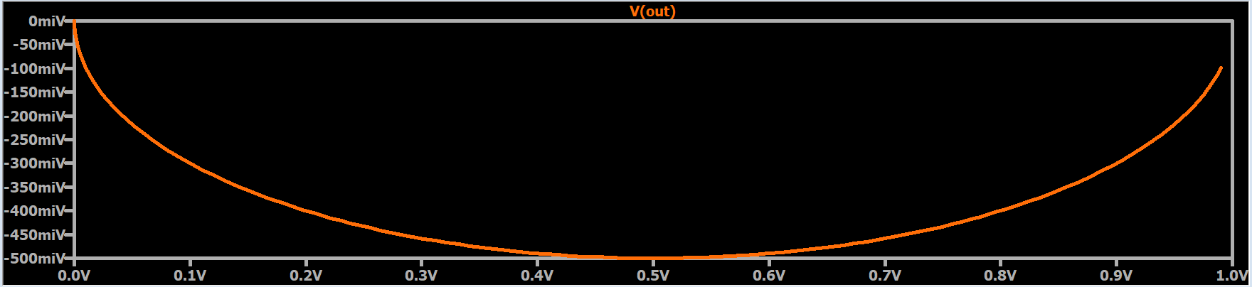
Why Doesn't My Nyquist Plot Look Right?
There are two reasons for this:
- First, the visual format of the plot window is not consistent with the complex plane, which is typically represented as a graphical area in which the two axes have the same relationship between numerical values and linear space.
- Second, the axes are along the left and bottom edges of the plot, as in a Cartesian graph; in a polar plot, we expect the axes to be drawn such that they pass through the point (0, 0).
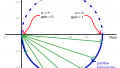
To remedy the first problem, modify the limits of an axis such that both axes have the same numerical range, and then resize the plot window so that it is square. If I want to ensure that the curve is a mathematically accurate representation of the transfer function, I place a good old-fashioned ruler next to my screen and adjust the plot window until the displayed length of the horizontal axis is equal to the displayed length of the vertical axis.
For the second problem, all you need to do is activate a cursor and move it along the curve until it reaches the point (0, 0). Now you have horizontal and vertical lines that divide your Nyquist plot into four quadrants. I recommend that you force (if necessary) both axes to include positive and negative values so that you can clearly see all four quadrants.
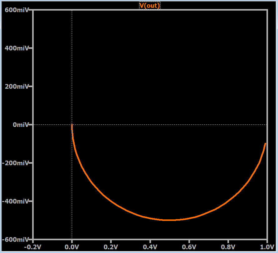
Magnitude and Phase
As you can see in the example, both axes have units of volts, but the labels in the vertical axis include the letter “i” to remind us that this is the imaginary dimension of the complex plane. If you activate the second cursor, you can slide it along the curve, and LTspice will report the magnitude (i.e., $$\sqrt{(Re)^2+(Im)^2}$$) and the phase.
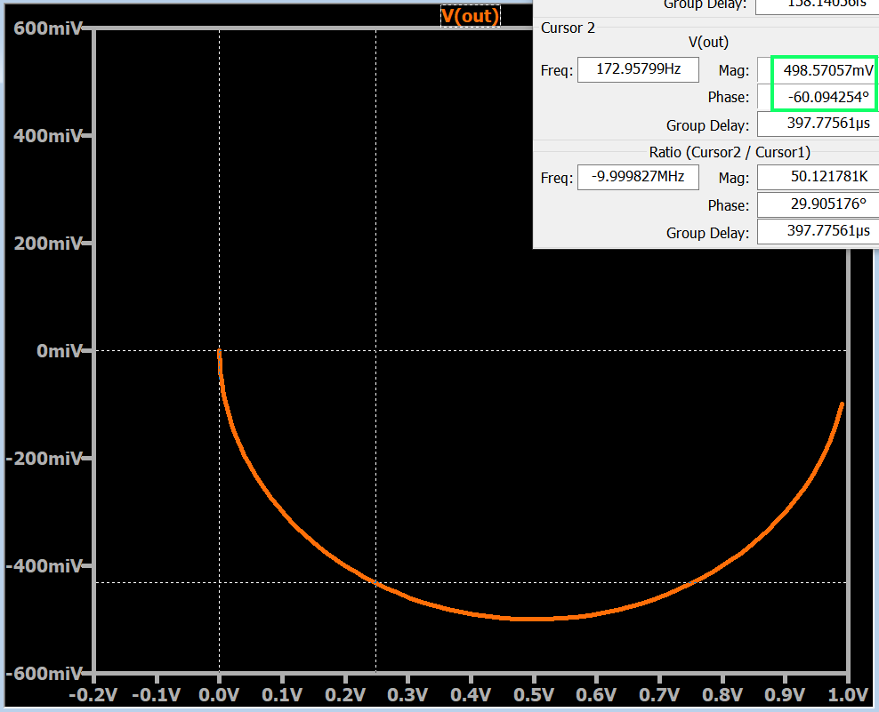
Frequency in the LTspice Nyquist Plot
A typical Nyquist curve cannot provide numerical frequency information because it represents an infinite range of frequency values. Anything divided by infinity is zero, so if we tried to analyze the Nyquist curve in terms of typical proportionality, any finite numerical frequency—10 Hz, 1 kHz, 100 MHz, etc.—would be located at the starting point of the curve.
However, the LTspice Nyquist plot manages to combine a curve whose shape corresponds to an infinite frequency range with the numerical frequencies that we would expect from a Bode plot. This significantly increases the appeal of the Nyquist technique, because you can use the cursors to find the gain and phase shift at a given frequency, or the frequency at which the circuit has a specified gain or phase shift.
Example Nyquist Plot in LTspice
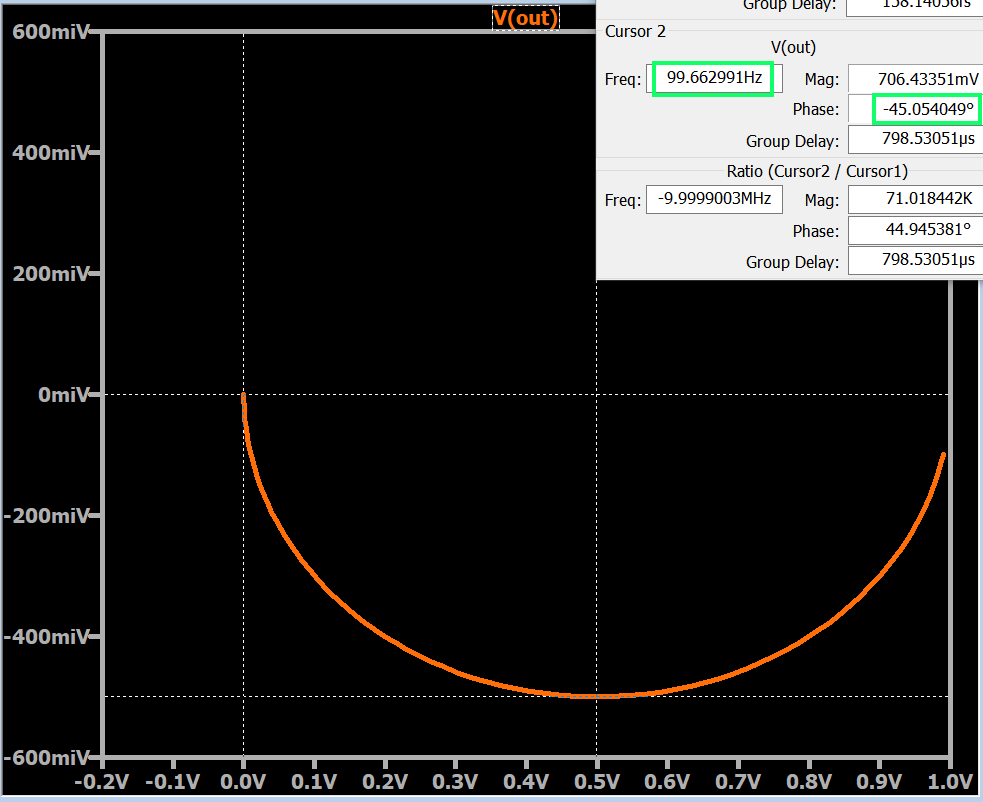
The example plots shown in this article represent the transfer function of a first-order RC low-pass filter. The component values are R = 160 Ω and C = 10 μF, which result in a cutoff frequency of approximately 100 Hz.
Those of you who have read the preceding articles (particularly the second one in the series on cutoff frequencies in Nyquist plots) know that the location on the curve that corresponds to the cutoff frequency has an angle of –45°, and this is exactly what we see in the LTspice Nyquist plot shown below.
One final note: As you may have noticed, the curve does not include an arrow that indicates the direction of increasing frequency. The arrow isn’t necessary, though, because this information is available via the cursors.
I hope that this article has given you a good overview of the Nyquist-plot functionality in LTspice. If you have any relevant tips or tricks, feel free to share them in the comments section below.
This article is Part 5 in a series on Nyquist plots. All articles in this series are listed below in order of publication.
- How to Use a Nyquist Plot for AC Analysis
- Understanding Cutoff Frequency in a Nyquist Plot
- Understanding Nyquist Plots for Second-Order Filters
- How to Use Nyquist Plots for Stability Analysis
- LTspice for Nyquist Plot Analysis