 Facebook
 Google
 GitHub
 Linkedin
How to Use a Nyquist Plot for AC Analysis
This article introduces the Nyquist plot and explains how to interpret this alternative method of visually evaluating a system’s frequency response.
This article introduces the Nyquist plot and explains how to interpret this alternative method of visually evaluating a system’s frequency response.
Most electrical engineers are thoroughly familiar with Bode plots. We use this term to refer to graphs in which the horizontal axis indicates logarithmic frequency and the vertical axis indicates magnitude (expressed in decibels) or phase. The original Bode plot was a straight-line approximation of a system’s actual frequency response, but nowadays we use the term also for mathematically precise plots generated by simulation software.
There is, however, another method of visually describing the way in which a system responds to different input frequencies. It’s called the Nyquist plot (or Nyquist diagram), and it is used primarily for stability analysis. In may be less intuitive than the Bode plot, but it more directly indicates whether an amplifier will be stable, and it can simultaneously convey magnitude and phase information.
Polar Plots vs. Cartesian Plots
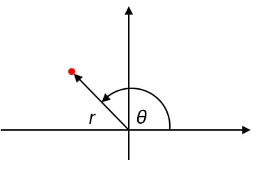
The Nyquist diagram is a polar plot, and I think that we should begin this discussion by briefly reviewing the concept of polar coordinates.
The most common type of graph has an independent variable that increases along a horizontal axis and a dependent variable that is expressed by means of changing vertical position. We use the word “Cartesian” to identify this system, which conveys information by means of horizontal and vertical distance from two axes.
A polar plot, on the other hand, conveys information by indicating magnitude and angle. The magnitude corresponds to the radial distance from the origin to any point on the curve, and the angle is measured counterclockwise from the positive horizontal axis. In the diagram below, the magnitude is denoted by r, and the angle is denoted by θ.
Complex Numbers
Since polar plots are inherently bound to the notion of an ordered pair consisting of magnitude and angle, it’s not surprising that they are particularly useful when we’re working with complex numbers. A complex number expressed in polar form can be transferred directly to a polar plot as magnitude and angle, or we can use the rectangular form to situate a point by assigning the imaginary part to the vertical axis and the real part to the horizontal axis.
The Nyquist Plot
A Bode plot conveys magnitude or phase versus frequency. Thus, you need two plots to describe a system’s magnitude and phase response (or at least you need two Bode curves—you can incorporate two curves into the same plot).
In a Nyquist diagram, on the other hand, only one curve is required. This is possible because the Nyquist plot is polar: every point on the curve indicates both magnitude (via distance from the origin) and phase (via geometrical angle), and the numerous different points that form the curve reflect the system’s response to numerous different input frequencies. The frequency in a Nyquist plot extends from 0 to infinity, and an arrow is used to indicate the direction in which frequency is increasing.
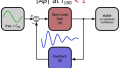
I think that this will be much more clear after we consider an example. The following diagram is the Nyquist plot for a first-order RC low-pass filter.
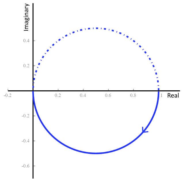
Let’s examine this plot in detail to make sure that we understand what we’re looking at.
Our Nyquist Plot Example
Q: First of all, why are there two curves?
A: The solid line is for positive frequencies, and the dotted line is for negative frequencies. They are mirror images of each other. Just ignore the dotted line.
Q: Where is the frequency information?
A: Remember, the curve extends from ω = 0 to ω = ∞, and the arrow indicates the direction of increasing frequency. Thus, the solid-line curve begins at ω = 0 on the right side of the plot (at a value of 1 on the real axis) and ends at the origin, which corresponds to ω = ∞.
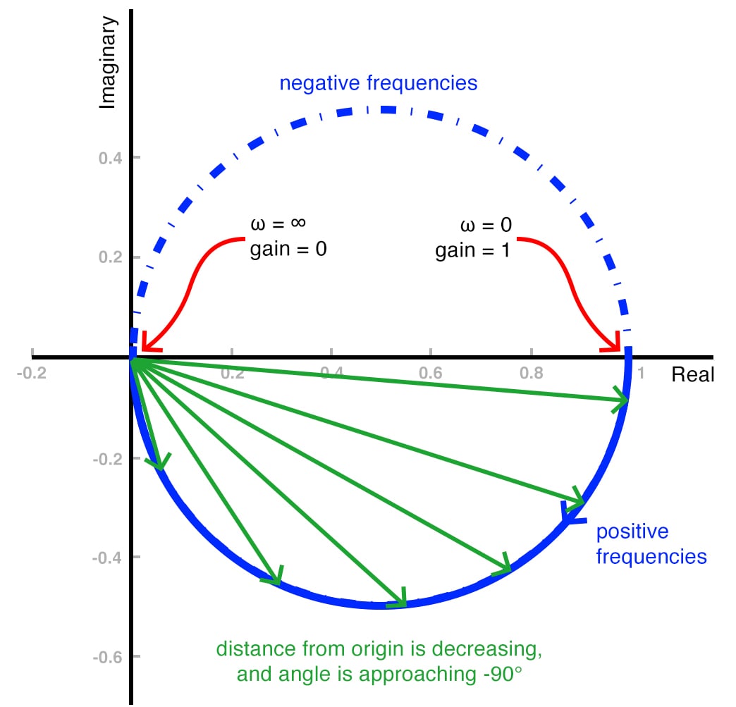
Q: OK, but how am I supposed to interpret a semicircular magnitude response?
A: Fortunately, we’re already familiar with the behavior of an RC low-pass filter, so let’s use what we know to unravel this Nyquist plot. At the point where the curve begins (i.e., at ω = 0), the distance from the origin is 1. In other words, the low-frequency gain is unity, as expected. As frequency increases, the radial distance from the origin to the curve decreases—again, this is what we expect, because shorter radial distance corresponds to more attenuation. At the point where the curve ends (i.e., ω = ∞), the distance from the origin to the curve is zero, because when frequency “reaches” infinity a low-pass filter produces infinite attenuation.
Q: This is starting to make sense. I can see how the angle starts at 0°, as expected, but a low-pass filter should have a final phase shift of –90°. How is that reflected in the Nyquist plot? I can’t measure the phase of a point that is directly on top of the origin.
A: That is a bit confusing, it’s true, but if you focus on the behavior of the curve as it approaches the origin, you can see that the angle is tending toward –90°. This is depicted in the following plot, which also serves as a summary of what we’ve learned so far.
Conclusion
I hope that you now have a clear understanding of the most basic characteristics of a Nyquist plot. We’ll explore this topic further in the next article.
This article is Part 1 in a series on Nyquist plots. All articles in this series are listed below in order of publication.
- How to Use a Nyquist Plot for AC Analysis
- Understanding Cutoff Frequency in a Nyquist Plot
- Understanding Nyquist Plots for Second-Order Filters
- How to Use Nyquist Plots for Stability Analysis
- LTspice for Nyquist Plot Analysis


I’ve been hoping someone would do an introduction article like this.
So far - it makes sense.
I’ll look forward to more articles on Nyquist.
I keep reading “In the next article I will discuss…” Where are the links to the next article? How do I follow this in a linear fashion?