 Facebook
 Google
 GitHub
 Linkedin
How to Perform Frequency-Domain Analysis with Scilab
In this article we’ll work with sinusoidal signals in the frequency domain using Scilab’s fast Fourier transform (FFT) functionality.
In this article we’ll work with sinusoidal signals in the frequency domain using Scilab’s fast Fourier transform (FFT) functionality.
Supporting Information
In a previous article, I introduced Scilab and the concept of digital sinusoid generation, and we used the plot() command to display time-domain waveforms. The primary goal in this article is to understand and gain experience with Scilab’s fft() command, which allows us to display waveforms in the frequency domain. A frequency-domain representation of a single-frequency sinusoid isn’t very interesting, though, and in the next article we’ll look at frequency-domain analysis in the context of RF modulation.
The FFT
The Fourier transform provides a way of identifying the frequency content of a signal. The original Fourier transform is a mathematical procedure that takes an expression that is a function of time and produces an expression that is a function of frequency. If we want to generate this same type of information in the context of sampled signals, we can use the discrete Fourier transform, abbreviated DFT. My guess is that some people who have often heard the term “FFT” are not familiar with the term “DFT.” The FFT (fast Fourier transform) is simply a name used to refer to algorithms that can efficiently perform DFT calculations; you can learn more about the FFT here.
We can generate DFT data for a waveform by including the corresponding array as an argument in an fft() command. However, a command such as fft(BasebandSignal) will not produce data that can be displayed as a typical frequency-domain plot.
The first reason for this is the fact that the results of the DFT computation are complex numbers that convey both magnitude information and phase information. Often we are interested only in the magnitude (or the word “amplitude” might be more intuitive here) of the signal’s frequency components, and we can extract this magnitude data using the abs() command.
Another issue is the lack of actual frequencies; we discussed this same complication, though with regard to time-domain sampled signals, in the previous article. When we have a command such as fft(BasebandSignal), the input array is just a series of numbers. This series of numbers says nothing about corresponding real-world frequencies, and consequently we have to provide that information elsewhere in order to generate a more informative spectrum.
The Discrete Fourier Transform of a Sine Wave
In this article we will be working with a 10 kHz baseband signal and a 100 kHz carrier. (I chose this carrier frequency for the sake of convenience; in a typical RF application it would be much higher.) The sampling frequency will be 1 MHz.
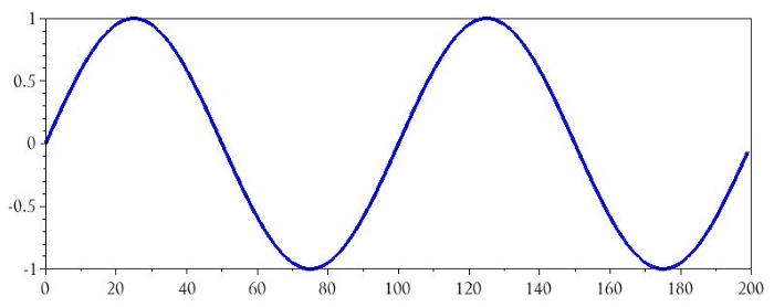
Let’s start by creating the baseband signal and then looking at the time-domain and frequency-domain plots.
BasebandFrequency = 10e3;
SamplingFrequency = 1e6;
BufferLength = 200;
n = 0:(BufferLength - 1);
BasebandSignal = sin(2*%pi*n / (SamplingFrequency/BasebandFrequency));
plot(n, BasebandSignal)
The following commands will generate a frequency-domain representation of this waveform:
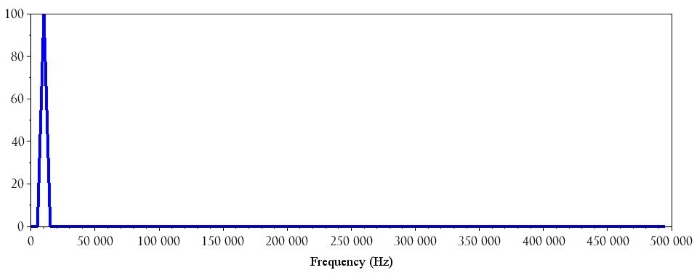
BasebandDFT = fft(BasebandSignal);
BasebandDFT_magnitude = abs(BasebandDFT);
plot(BasebandDFT_magnitude)
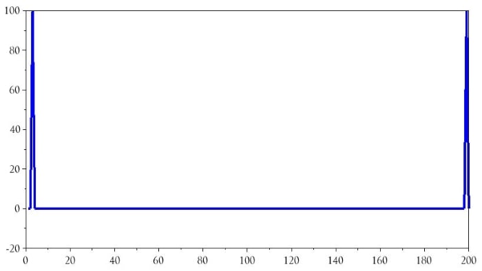
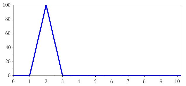
I would not describe this plot as particularly helpful, but it’s a good start. The first issue is that a single-frequency sine wave has resulted in two DFT frequency components. This occurs because the DFT calculations generate symmetric results—i.e., the right half of the plot is a mirror image of the left half of the plot. We can eliminate this distraction as follows:
plot(BasebandDFT_magnitude(1:(BufferLength/2)))
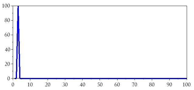
All we’ve done here is tell the plot() command to display only the first half of the data. Let’s zoom in on the spike:
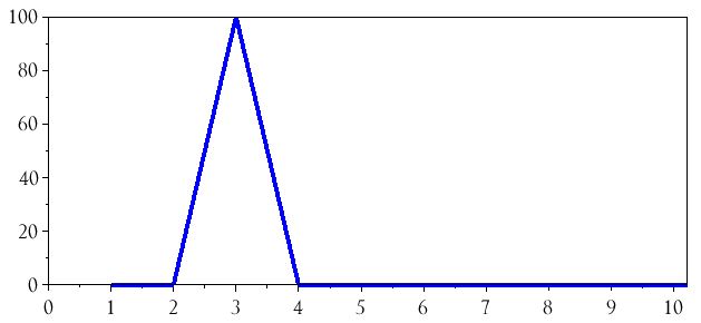
Why does the frequency component correspond to 3 on the horizontal axis? Well, if you look back at the time-domain plot, the array that was passed to the fft() command has two full sine-wave cycles. In the DFT environment this becomes a “frequency” of 2, and since our plot begins at a horizontal-axis value of 1 instead of 0, a “frequency” of 2 is located at value 3 on the horizontal axis. We can remedy this confusing situation by plotting the FFT results with respect to the array n:
plot(n(1:(BufferLength/2)), BasebandDFT_magnitude(1:(BufferLength/2)))
Introducing Real Frequencies
The spectrum currently shows a single frequency component at 2; the next step is to change the horizontal axis so that the values correspond to the actual frequencies used in the system. Fortunately, this is not difficult. Consider the following observations:
- The DFT result is influenced by the length of the buffer. If we had a 300-sample buffer, there would be 3 full baseband cycles and the DFT spike would be located at 3 on the horizontal axis instead of 2. Thus, we need to somehow incorporate the buffer length into the modification of the horizontal axis.
- The sampling frequency is the fundamental reference for the entire sampled system. Once the signals have been digitized, their relationship to absolute time is replaced by a relationship to a sampling frequency.
- The highest frequency that the system can process is equal to the sampling frequency (fs) divided by 2. Within the context of a given sampled system, frequencies above fs/2 don’t really exist because they can’t be distinguished from corresponding lower frequencies.
The values on the horizontal axis of the DFT results are counting up, in evenly spaced increments, from 0 to the system’s maximum frequency, and the size of the increment is governed by the length of the buffer. Thus, to introduce real-life frequencies into the DFT spectrum, we need to plot the magnitudes with respect to a series of values that increase from zero to fs/2 (actually, to get the correct array length the range will extend to the value immediately preceding fs/2). We can accomplish this as follows:
HalfBufferLength = BufferLength/2;
HorizAxisIncrement = (SamplingFrequency/2)/HalfBufferLength;
DFTHorizAxis = 0:HorizAxisIncrement:((SamplingFrequency/2)-HorizAxisIncrement);
plot(DFTHorizAxis, BasebandDFT_magnitude(1:HalfBufferLength))
xlabel("Frequency (Hz)")
Here is the zoomed-in version:
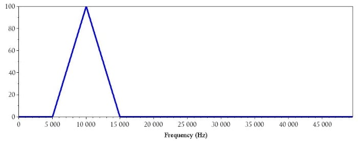
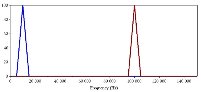
As you can see, the baseband signal’s frequency component is now identified as 10 kHz. We can follow the same procedure for the 100 kHz carrier signal:
CarrierSignal = sin(2*%pi*n / (SamplingFrequency/CarrierFrequency));
CarrierDFT = fft(CarrierSignal);
CarrierDFT_magnitude = abs(CarrierDFT);
plot(DFTHorizAxis, CarrierDFT_magnitude(1:HalfBufferLength))
Conclusion
I hope that this article has helped you understand how to interpret the data provided by a discrete Fourier transform. You can now use Scilab to analyze the frequency content of signals that you have generated mathematically or captured via analog-to-digital conversion.
Related Content


Why FFT of Samples spread across two full sine-wave cycles, gives peak at 2XSine_wave_frequency?